🌍🌎🌏🌍🌎🌏🌍🌎🌏🌍🌎🌏🌍🌎🌏🌍🌎🌍🌎🌏🌍🌎🌏🌍🌎🌏🌍🌎

Now, your mission consists of collecting data about different map projections to fill in a table with the missing information. Before that, you have to match the map projections with their corresponding picture.
· Please, click on the link below to fill in the table. Table of map projections
You will find all the information you need by clicking on the following links:
Check out the following link to discover the ten most important map projections according to The future mapping company: Top 10 World Map Projections
Now, take a look at amazing map projection transitions by clicking on the following links:
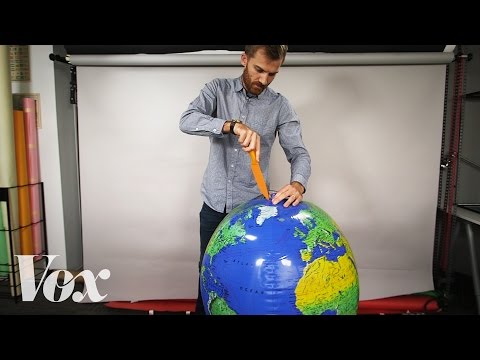
The following amazing video will show that the maps we are used to see don’t really represent the Earth:
2) You have
learned a great deal about map projections, now you are expert enough
to answer the following questions:
· Why does distortion occur in all map projections?
· Why do Google maps
still use Mercator projection?
· Which map projection would you use to locate places
geographically?
· Which one would you use to compare areas?
· Why is it said that Mercator's projection is unrealistic and unfair? Do you agree?
· Which is the shortest way to go from Melbourne (Australia) to Santiago (Chile)?
· Which is bigger, Africa or North America?
· Which is bigger, Greenland or Africa?
· Which is bigger, Mexico or Alaska?
3) You are part of
the most important team of cartographers in the world. Your mission now
is to help different people or organisations to choose the most appropriate map
projection for them:
· Help an explorer from the 16th Century, who is trying to
navigate the ocean with only a compass. Which of the map projections would you
use?
a) Mercator
b) Gall-Peters
c) Lambert
d) Goodee) Mollweide
Why?
· An NGO needs your help in order to choose a fair map. A realistic map in terms of size, which shows the real area of Africa and allows comparing the area of different continents and countries in a realistic way.
a) Mercator
b) Gall-Peters
c) Lambert
d) Goodee) Mollweide
Why?
· A group of aeronautical pilots ask you for advice.
They need to use aeronautical charts to plan their flights. These charts are
based on a map projection and they don’t know which one they should
use.
a) Mercator
b) Gall-Peters
c) Lambert
d) Goode
e) Mollweide
Why?
4) You have looked at different map projections, answered challenging
questions and helped different organisations. Now, it’s time for your
team to take a decision: which of the map projections would you like to
study thoroughly? Working in team is extremely important so reach an agreement
with your classmate on which of the map projection you would like to know in
depth.
5) Good choice! Now you have to create an infographic about your map projection.
OK, but… what is an infographic? If you don’t know it, click on the link to learn about it. Infographics
Once you have written the text for your infographic, make the design using the app Canva. It’s very intuitive and easy, as there is plenty of templates: Canva Infographics
Here you have a template I created to help you:

You can use the following checklist to make sure you don’t forget any relevant element. Checklist
6) Great job, guys! It’s time to show your discoveries to the whole class!
Together with your partner, prepare an oral presentation based on your infographic to explain the relevant information about your map projection. It’s specially important that you explain the distortion of your map projection properly.
Congrats!!! You are ready to write a reflection on the key initial question:
Are world maps wrong?

No comments:
Post a Comment